DMZ STORE
Rebranding
Overview
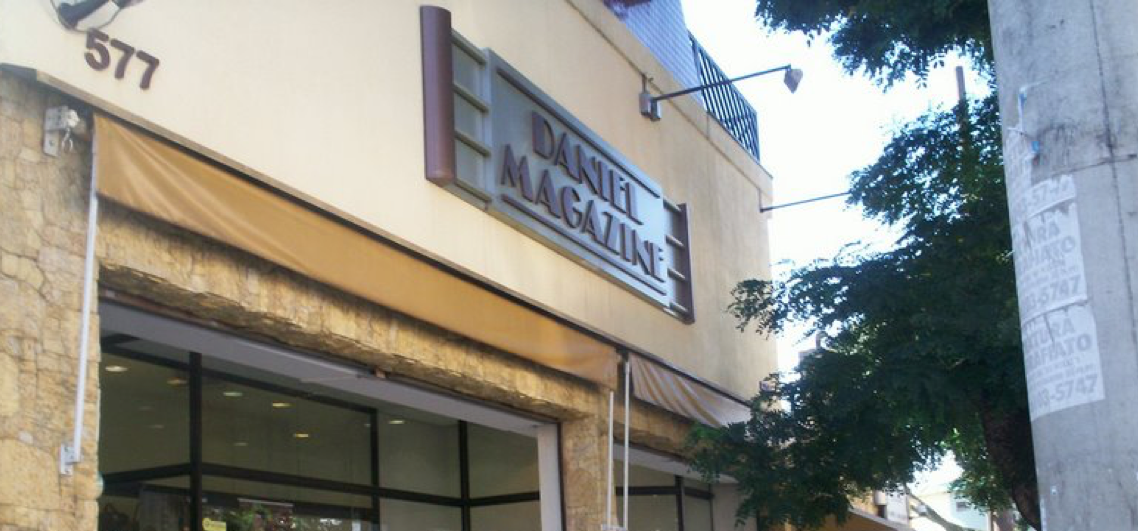
DMZ is a traditional fashion store in São Paulo. Pedro and Francisca Daniel founded it in the early sixties and it has passed through three generations of the family. It carries the best fashion brands in the world, in a space that holds its own next to the finest stores in London, Milan or Paris.
The rebranding came to me through Bruno Daniel, the CEO, who is also a client and a friend. Bruno is restless in the best sense: always a step ahead, always changing the way his customers shop.
Company
- DMZ Store
- www.dmzstore.com.br
Details
- Rebranding -
- Logotype
Category
- Fashion Store
Project Date
- March - 2017
The Opportunity
Bruno called to say he wanted to redesign the store brand, and that he was building a sneaker department inside DMZ called The White Room, which is another story. We met for coffee.
He told me the history of the company and where he wanted to take it. It was one of those conversations that make you want to start that same afternoon. We agreed to sketch some options and see whether a logotype could carry the design language the store already had.
The Challenge
Bruno's reputation is built on a relentless pursuit of excellence, so to meet it I had to understand how he thinks. I had been to the store many times and something was always different: a new arrangement, a new idea. That desire to be better every day was what I had to translate into a brand.
Design Process
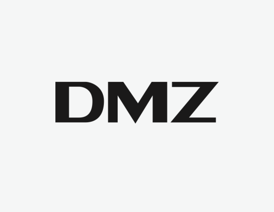
I needed a logotype that spoke to the store's market. I knew the place and I knew its customers, so I wanted something simple, clean and stylish, and I started on paper.
This phase usually takes at least two weeks of research. This time it did not. Knowing Bruno's taste and the brands he carries cut the distance. After around ten sketches I had something, so I took it to vector.
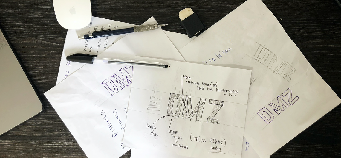
Eureka moment
These moments are rare. Most of the time you work hard, run studies and spend hours in front of a screen before you open a vector app at all.
I usually say a logotype is 98 percent research, sketching and thinking, and 2 percent execution. You build the concept, you choose the direction, and only then you go to Illustrator.
DMZ was one of the rare ones. The concept was already there. I only had to materialise it.
Presenting the logotype
I normally build a full presentation around a logotype and everything attached to it. For Bruno I showed a single option, just to check whether I was on the right path. He loved it and we kept it.
I had never had a logotype approved that easily. All that was left was refining: more symmetry, better kerning, the small corrections that make it sit right.

Applications
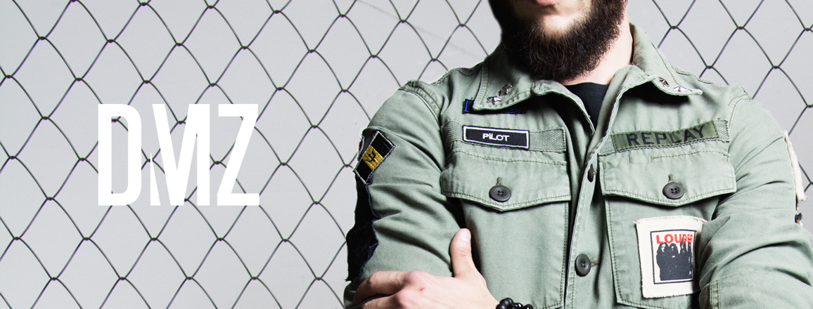
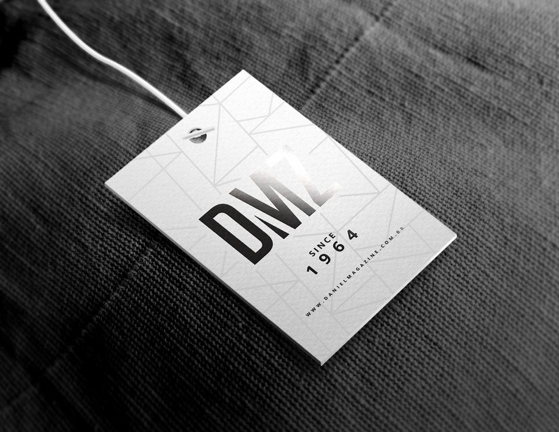
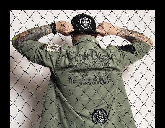
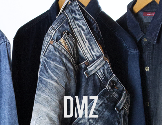
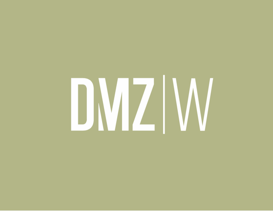
A few samples of the new logotype in real applications.
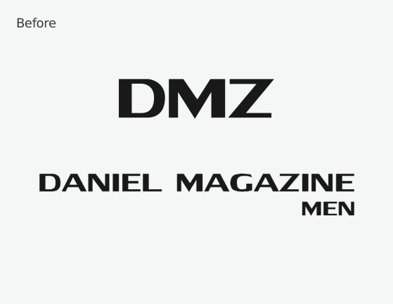
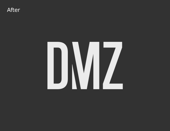
Before & After
The logotype before and after the rebranding.
Bruno’s comments
"When we handed over the mission to Kris to redesign the DMZ logo, we had no idea that the result would also resignify the brand value and the way it is seen by customers and suppliers. We can say that there has been a huge leap in these relationships since the design change."
In his own words
“Quando entregamos a missão ao Kris de redesenhar o logo da DMZ não tínhamos a noção que o resultado viesse a ressignificar também o valor da marca e a forma como é vista pelos clientes e fornecedores. Podemos dizer que houve um salto enorme nessas relações a partir da mudança do design."
Access the DMZ website:
www.dmzstore.com.br
Want to learn more?
Drop me a line
me@krisbasque.com